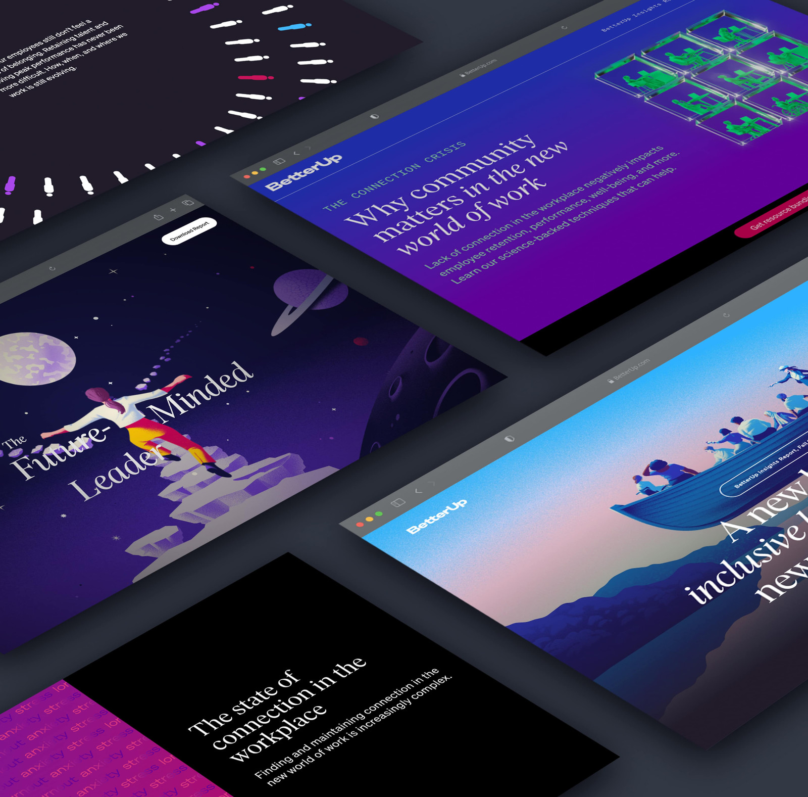
Turning research into something people would actually explore.
Every year, BetterUp publishes research on workplace dynamics, leadership, career growth, self-care, and the changing world of work.
Traditionally, those findings were compiled into downloadable PDFs for partners and B2B clients.
As the brand evolved, the opportunity became larger: bring the findings to life on the web, use the report as a marketing experience, and make the underlying research easier to discover before asking someone to download anything.
The report became a product experience.
The work evolved across multiple years, with each report teaching us something different about storytelling, engagement, and conversion.
Worked with an agency to shape the interactive report experience, while creating the supporting report and marketing assets.
Continued the immersive format and helped lead the microsite and supporting campaign assets.
Led the design direction, microsite, modules, reports, social assets, and event-related materials with a stronger focus on conversion.
A beautiful experience is not useful if people leave before the value arrives.
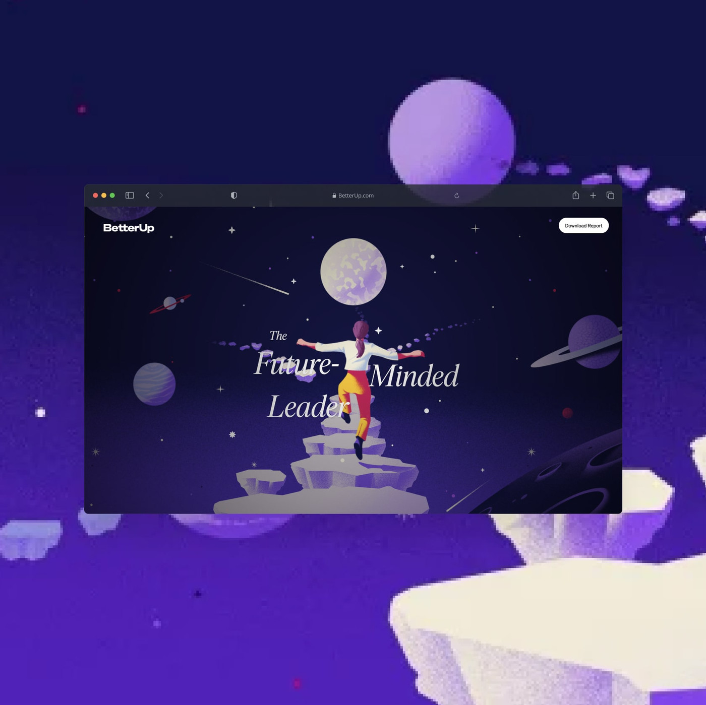
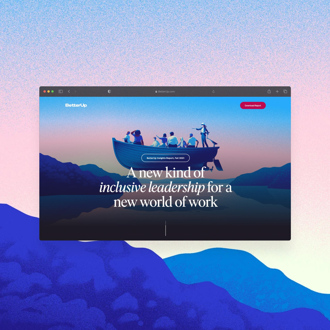
The 2020 and 2021 interactive reports were considered strong creative successes internally. They gave BetterUp a visually distinctive way to share its research.
But engagement data showed a different story.
Users dropped off early, and many never reached the later stages of the intended journey.
Immersive storytelling
Interactive pages made the research feel premium, differentiated, and useful for marketing and sales conversations.
The journey was too long
Important actions—downloads, registration, and next-step resources—arrived too late for many visitors.
Optimize for clarity first, then earn the interaction.
For the next report, I shifted the design strategy toward clearer communication of the data and a faster route to the downloadable report and signup.
The goal was not to strip away the brand experience. It was to make the hierarchy more purposeful.
Long immersive journey
Scroll-led storytelling emphasized exploration and visual delight before conversion.
Shorter, clearer path
Key insights appear earlier, calls to action stay visible, and supporting resources are integrated into the journey.
Give readers something useful before and after the report.
For the 2022 Insights Report, the experience expanded beyond the core findings.
We added practical resources that could reinforce the report theme while giving readers more reasons to continue engaging with BetterUp.
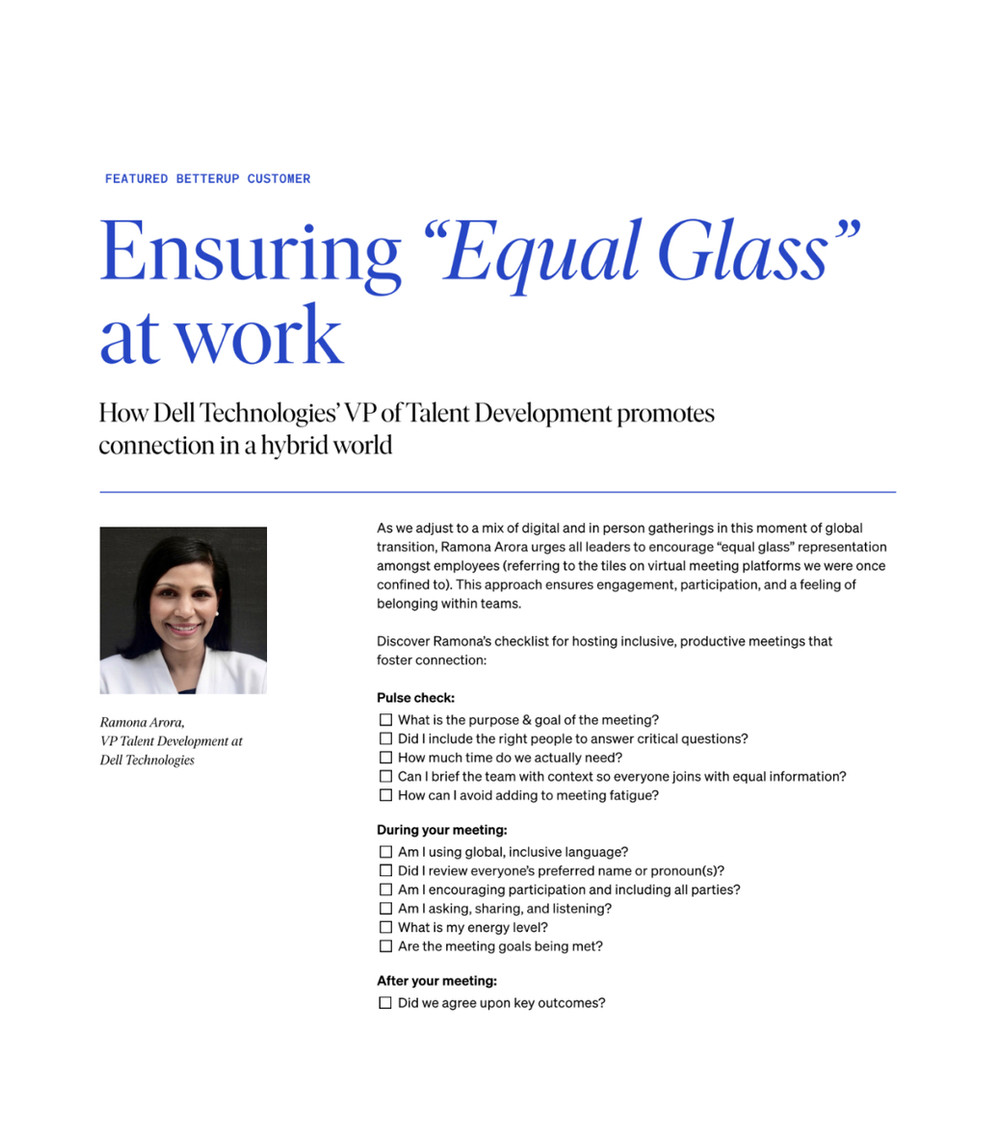
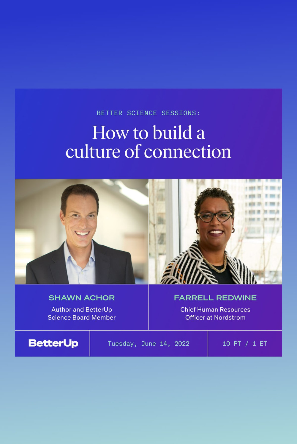
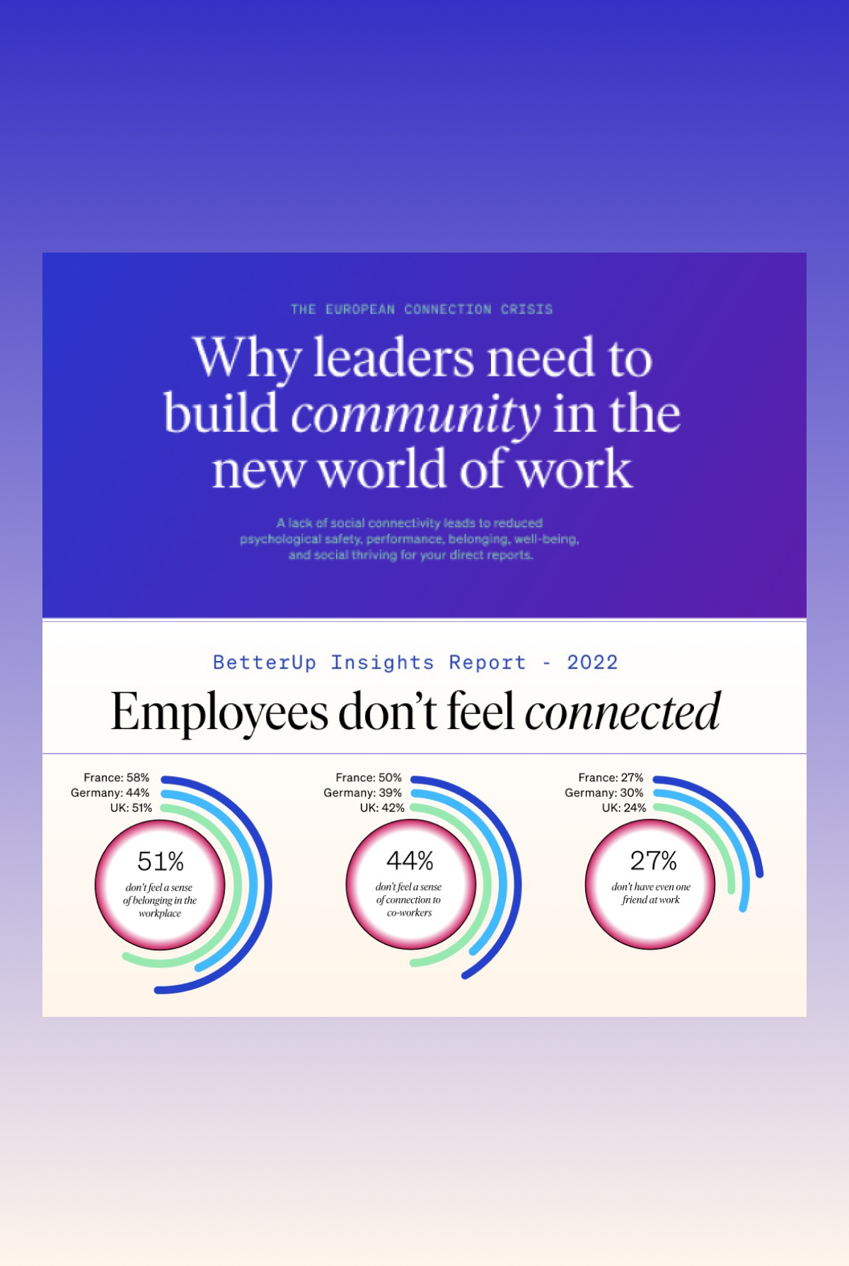
The report became the entry point, not the endpoint.
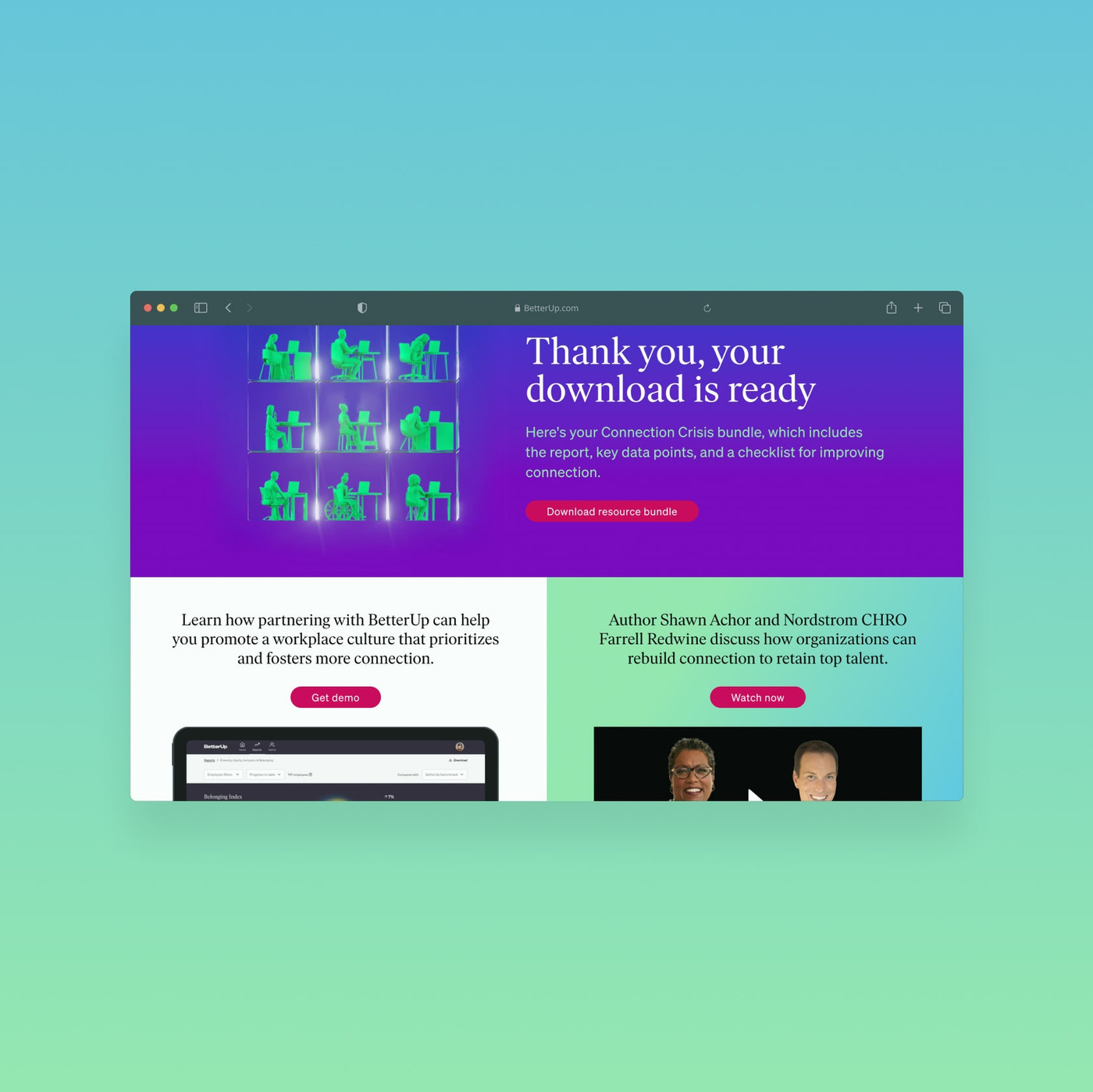
The redesigned experience treated the report as one part of a broader resource ecosystem.
That meant connecting editorial findings with events, additional research, downloads, and opportunities to engage more deeply with BetterUp.
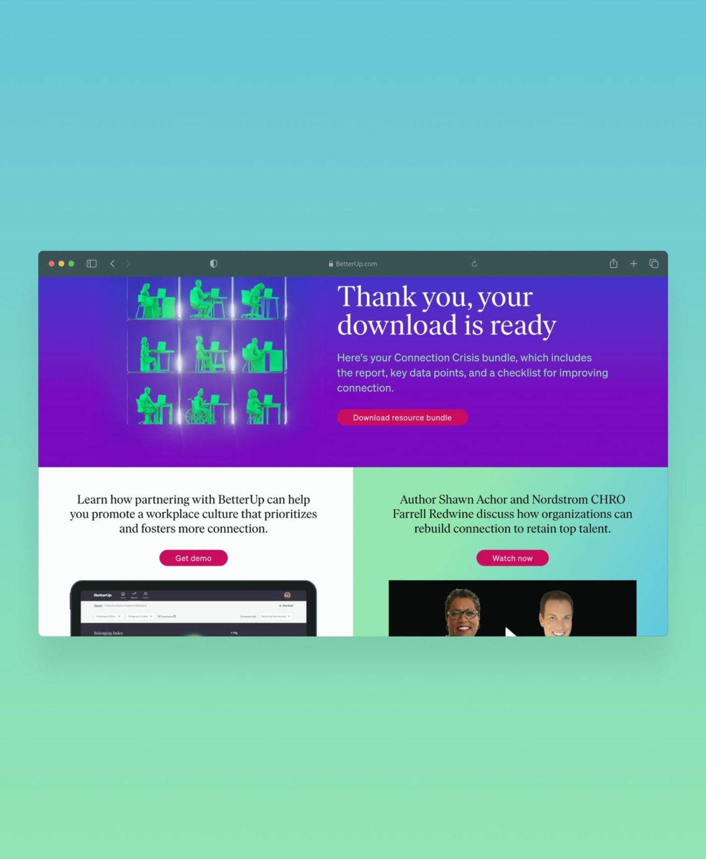
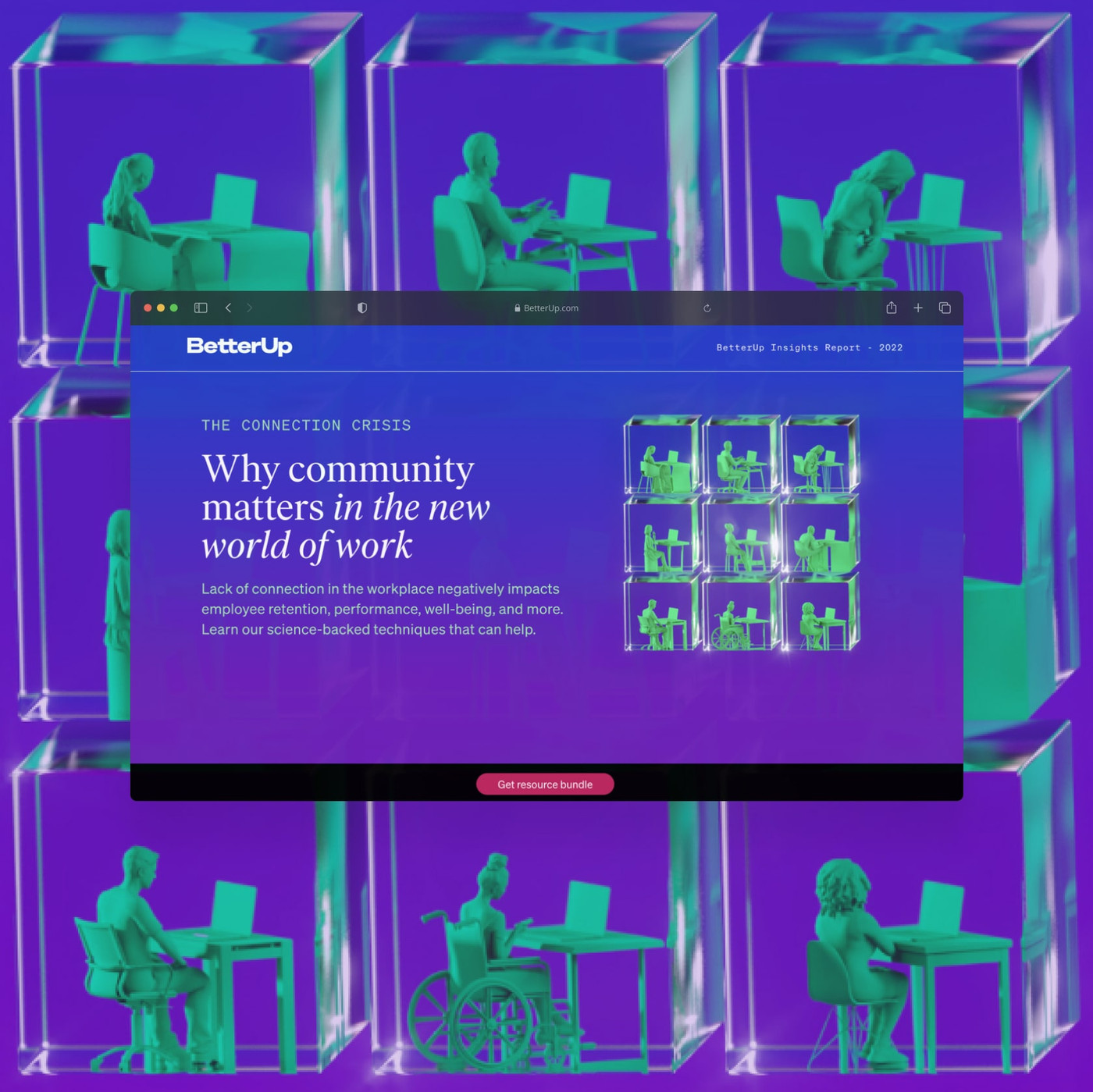
Short report page. Persistent CTA. Resource-rich thank-you page.
The new structure deliberately reduced the length of the initial report page and made the download path easier to understand.
A persistent footer bar kept the relevant action visible throughout the visit.
After registration, the thank-you page transformed into a resource center—guiding people toward the next useful step, whether that was an event, another report, or a demo.
The simpler structure improved the metrics that mattered.
Analytics showed an increase in report downloads and continued engagement with additional resources on the thank-you page.
That validated the decision to shorten the initial journey and make the next action clearer.
Conversion improved. The experience lost some of its magic.
The new design met the business goal, but senior leadership still missed some of the animation and immersion of previous reports.
That feedback was fair.
We also had less technical support than in earlier agency-led years, while producing more supporting assets under a tighter timeline.
The post-mortem made the next direction clear: do not choose between conversion and storytelling if the scope can support both.