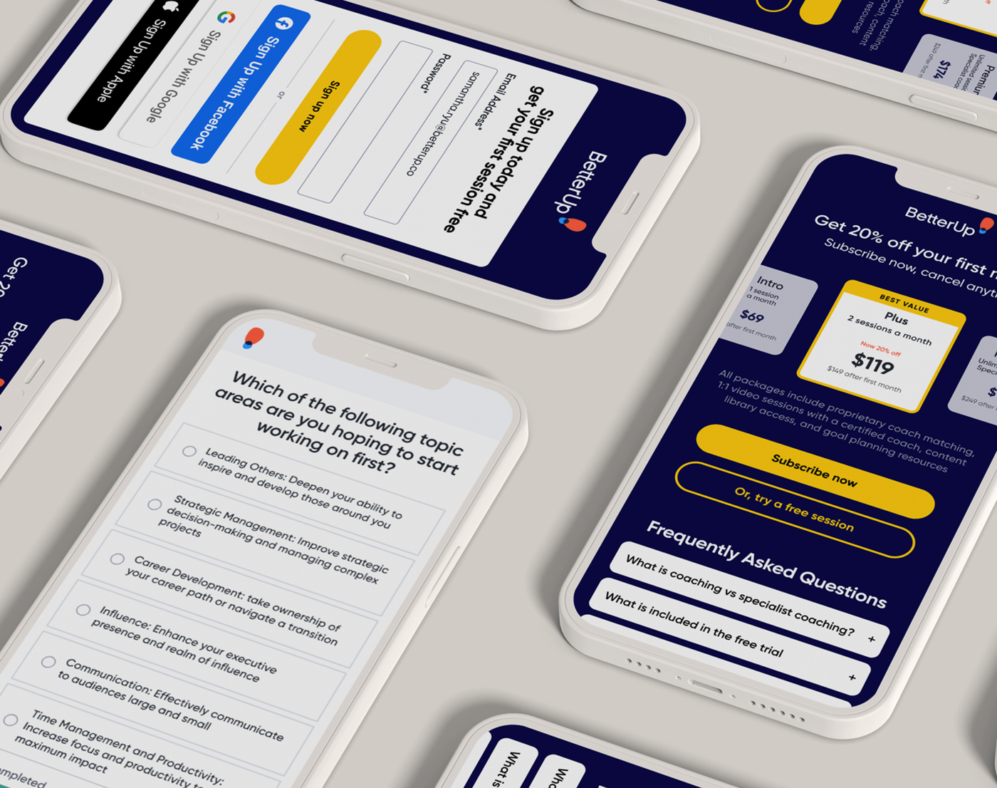
A new acquisition strategy exposed an old onboarding problem.
BetterUp was built primarily as a B2B enterprise platform. As the company expanded B2C acquisition, the existing new-member flow suddenly had to work much harder.
Marketing campaigns were offering complimentary first coaching sessions to attract new members.
That created a new design question: could someone move from a social ad to account creation, assessment, subscription choice, app download, and coaching session without losing confidence—or patience—along the way?
The offer was simple. The journey was not.
To support the B2C campaign, we needed to understand where the signup flow was introducing unnecessary friction and where that friction was hurting conversion.
Fast signup methods such as Google, Apple, or social login were not clearly available.
Users had to complete an extremely long assessment before reaching the complimentary session.
Payment details appeared only after users had invested significant time in the flow.
Users did not encounter the app prompt until after the assessment and session scheduling.
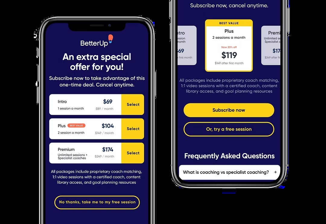
Special pricing and plan options were not visible enough to support an informed choice.
Critical reminders and next steps relied on email, making the experience feel fragmented.
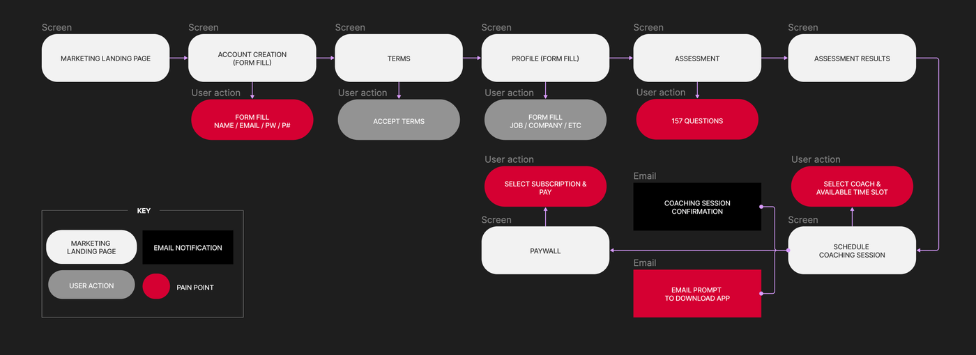
Follow the journey exactly as a new member would.
Our team tested the complete signup experience beginning from a social promotion for a complimentary membership.
Participants moved through the flow while sharing feedback during and after the experience.
I also completed the full journey myself and combined the findings into a broader UX and heuristic assessment.
Reward progress sooner. Make choices visible earlier.
The revised flow focused on completion and retention rather than simply reducing the number of screens.
Users needed earlier visibility into the decisions ahead of them, enough freedom to skip or defer commitment, and more immediate evidence that the time they had already invested was worthwhile.
We also wanted the app to become part of the journey earlier. Because this acquisition funnel included a complimentary coaching session, someone willing to install the app had already demonstrated meaningful intent.
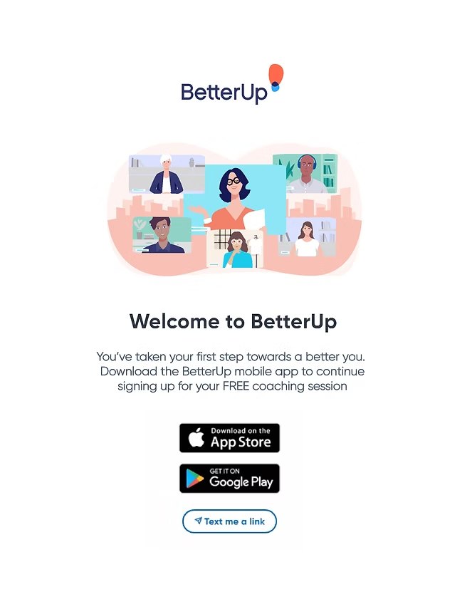
Ask for the app while motivation is still high.
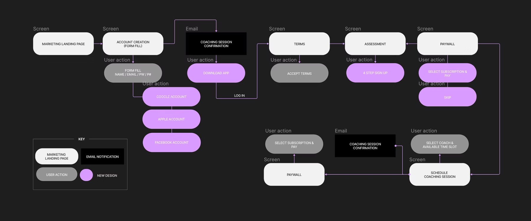
Originally, the app-download prompt appeared only after the user completed the long assessment and scheduled the first coaching session.
I moved that prompt earlier in the experience and made it a required step on mobile.
The hypothesis was straightforward: users who were already motivated by the complimentary session would be more willing to download the app before fatigue accumulated.
Expose the choice earlier without forcing the decision.
The previous experience introduced payment only after a substantial amount of effort.
In the revised flow, I moved the paywall earlier and gave users an explicit choice to subscribe or skip.
Copy and visual hierarchy made the promotional savings clearer while preserving the option to continue without paying.
Reduce friction before asking for anything harder.
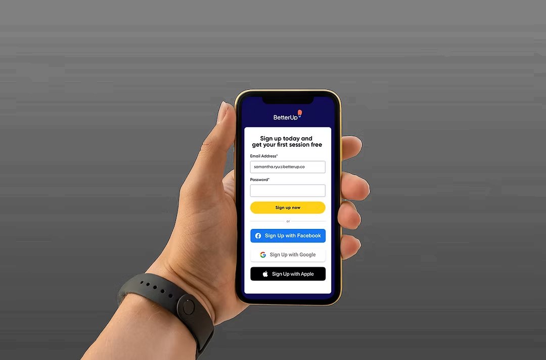
One-tap account creation had become a familiar convention, but the existing BetterUp flow did not make those options clear enough.
I redesigned the signup experience so alternative account methods such as Google, Apple, and social login were easier to recognize and use.
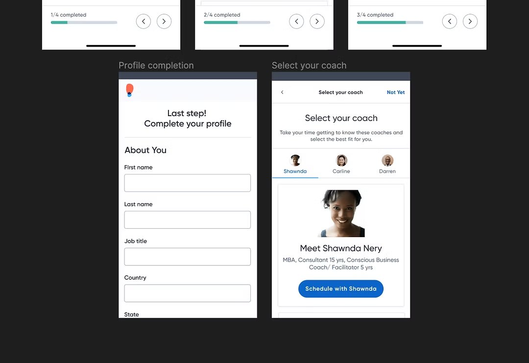
157 questions gave us data. It also gave users a reason to leave.
The assessment could uncover useful information for coaching and later personalization, but its length was excessive for someone entering through a B2C acquisition funnel.
We created shorter variants and tested whether reducing the assessment improved completion.
Protect the useful signal
Keep enough information to support the first coaching session and subsequent personalization.
Remove acquisition friction
A first-time user did not need to complete the same depth of profiling expected later in the product lifecycle.
Test the balance
Compare shorter assessment variants rather than assuming the minimum number of questions was automatically best.
The order of the journey mattered more than any single screen.
The redesigned flows were tested against the existing experience, with assessment variants compared against one another where relevant.
Users were more likely to install the app when asked before moving through the rest of the funnel.
Because users could skip, subscription selection before the complimentary session remained relatively unchanged.
Scheduling completion increased once assessment length was reduced.
The design problem became balancing useful coaching context against the cost of collecting it too early.