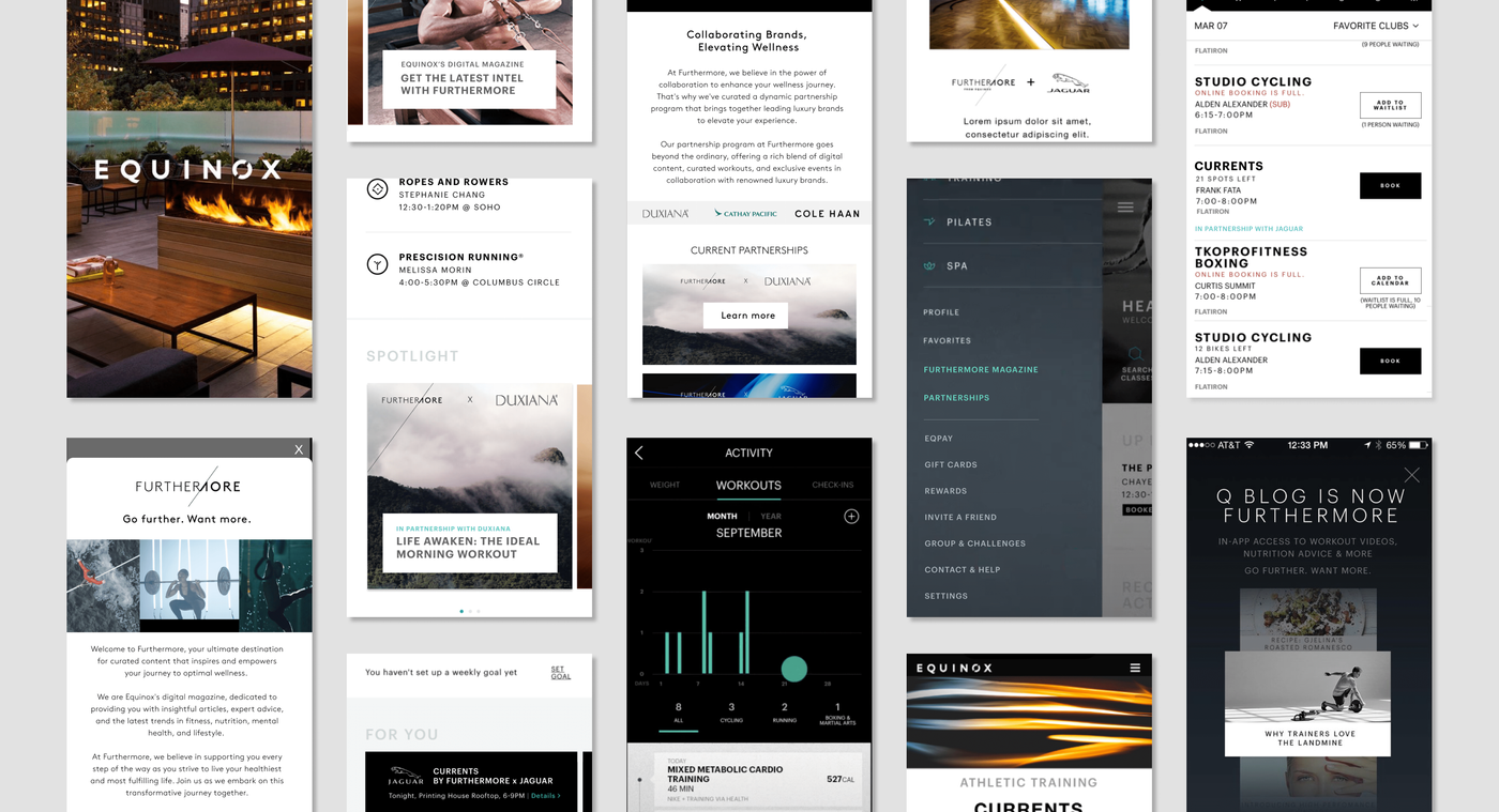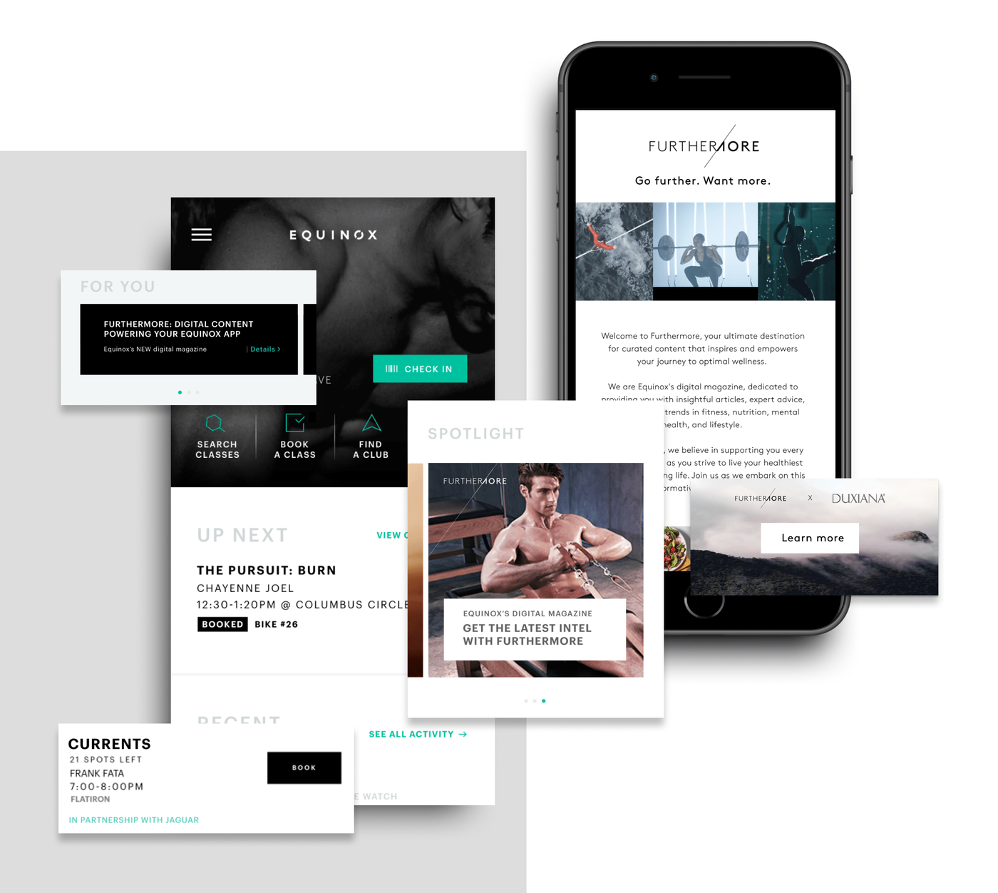
Content had grown into a business. The app had not caught up.
Furthermore began as Equinox editorial content, but had evolved into a business supporting member engagement and partnership revenue.
It already appeared in member emails and in-club displays, but its presence inside the Equinox app remained minimal.
The long-term opportunity was larger: make Furthermore a recognizable digital layer of the Equinox ecosystem, useful beyond the club and capable of supporting luxury-brand partnerships.
A growing business was hidden inside an app built before it mattered.
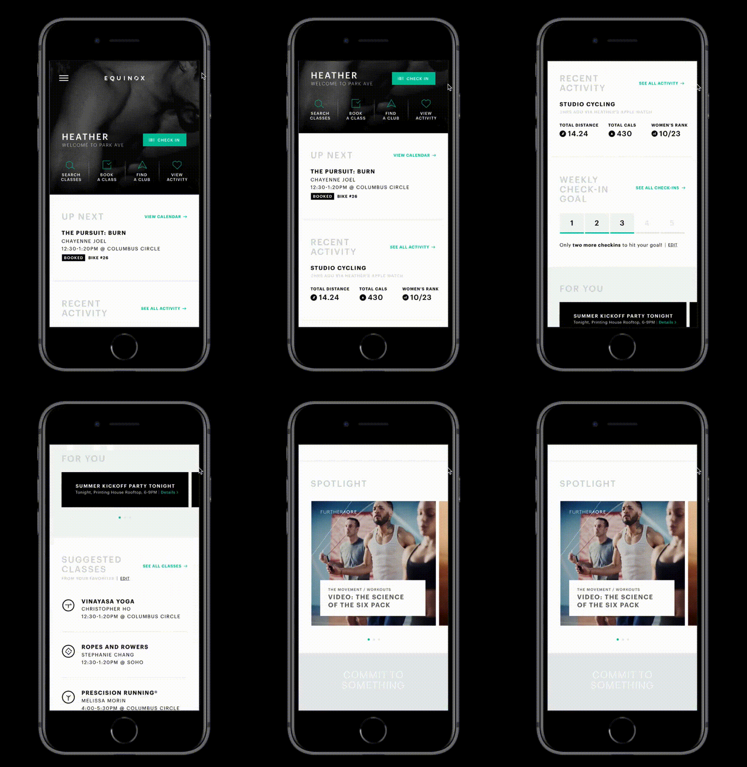
Because the app predated Furthermore's growth, the content had only one meaningful surface: a Spotlight module at the bottom of the home screen.
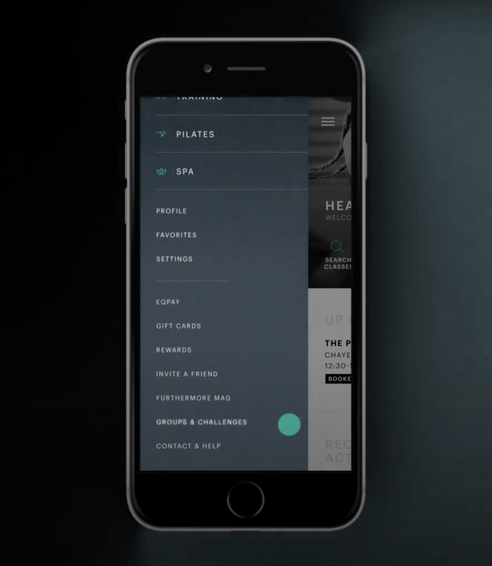
In global navigation, Furthermore sat near the bottom of an open menu alongside technical utilities, making it difficult to find and difficult to understand.
Start with the structure before designing new modules.
I used three research tracks to understand the current experience and what the app would need next.
Asked club members to locate Furthermore content inside the existing app.
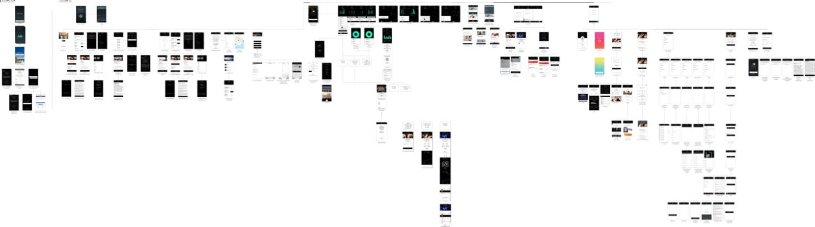
Mapped the app structure to understand hierarchy, grouping, and competing tasks.
Audited Furthermore content by type, purpose, and layout to identify what could work natively in-app.
Not every piece of content belonged in the app.
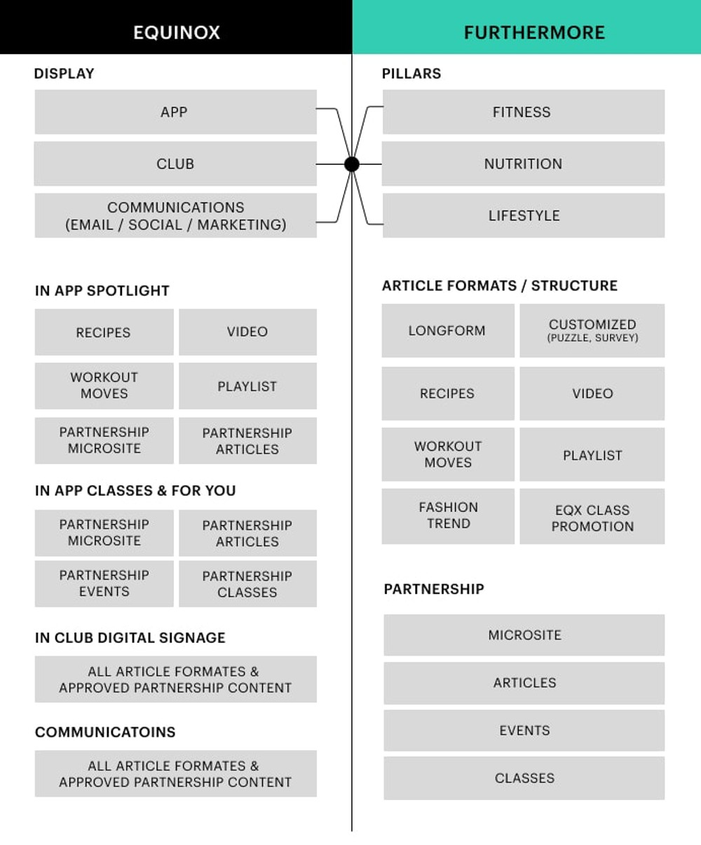
I filtered Furthermore content based on category, purpose, layout, and technical fit.
Some formats were excluded because they were poorly suited to mobile, pushed members outside the app, or introduced technical constraints.
Partnership content complicated that rule. A partnership might include articles, pop-up classes, events, special offers, or campaign microsites—making the limited Spotlight module a significant constraint.
Prioritize formats that could be consumed comfortably inside the app.
Avoid experiences that unnecessarily broke the member journey by sending users elsewhere.
Separate content that could use existing patterns from formats requiring new capabilities.
Leave room for branded experiences that did not fit standard editorial rules.
Move Furthermore up—but not too far.
Equinox already had other offerings such as Pilates and Spa. But those services involved booking, scheduling, and transactions, while Furthermore was primarily consumed as digital content.
Card testing and user testing helped clarify where members naturally expected it to live.
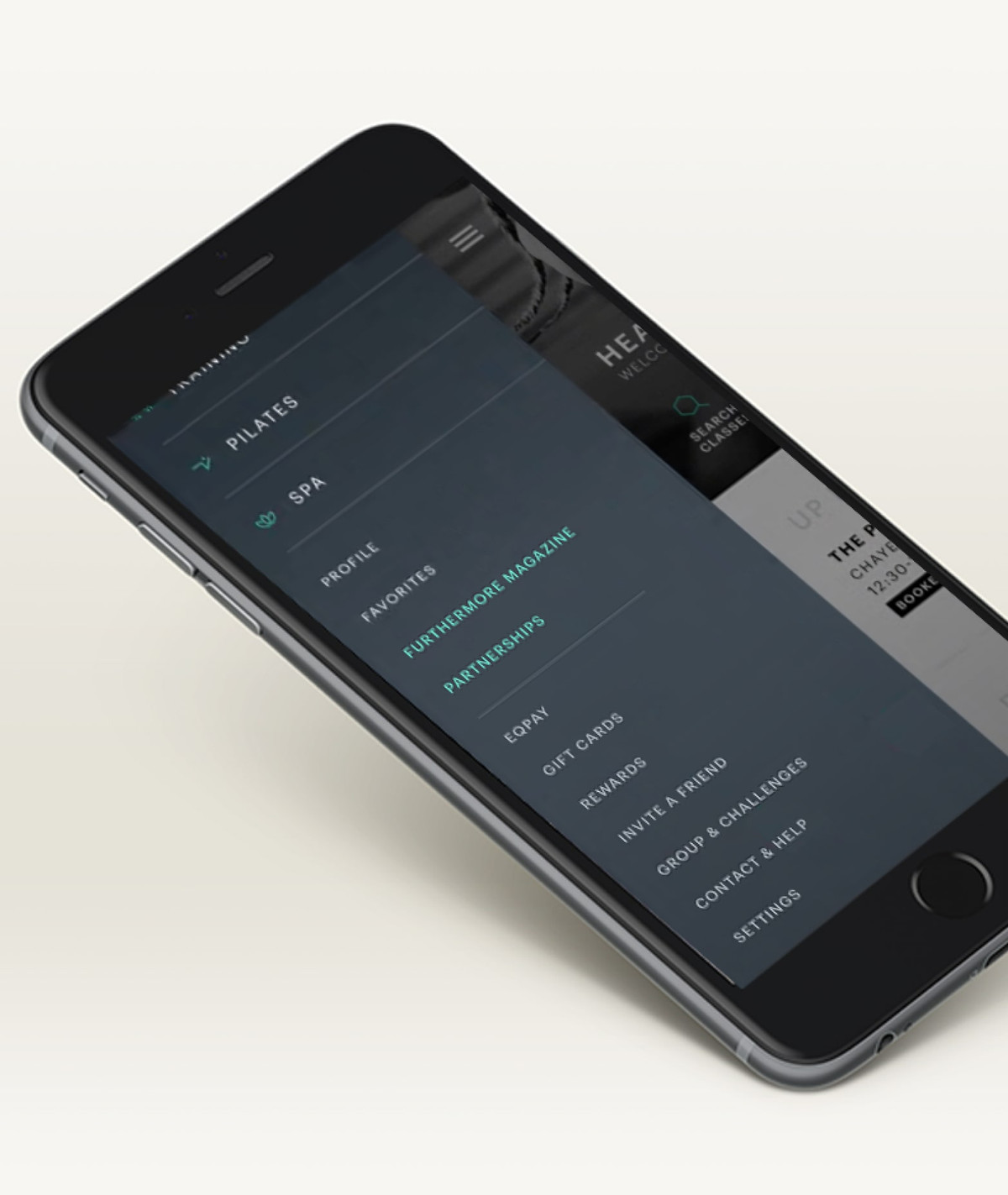
I paired those findings with business requirements and moved Furthermore into a second-tier position alongside Profile and Favorites.
Settings moved lower in the menu, where members still expected to find it.
Discoverability was only half the problem.
Interviews showed that members did struggle to find Furthermore—but many also did not understand what Furthermore was.
Even members receiving weekly Furthermore emails often failed to connect the brand back to Equinox.
Make the content recognizable before asking members to engage with it.
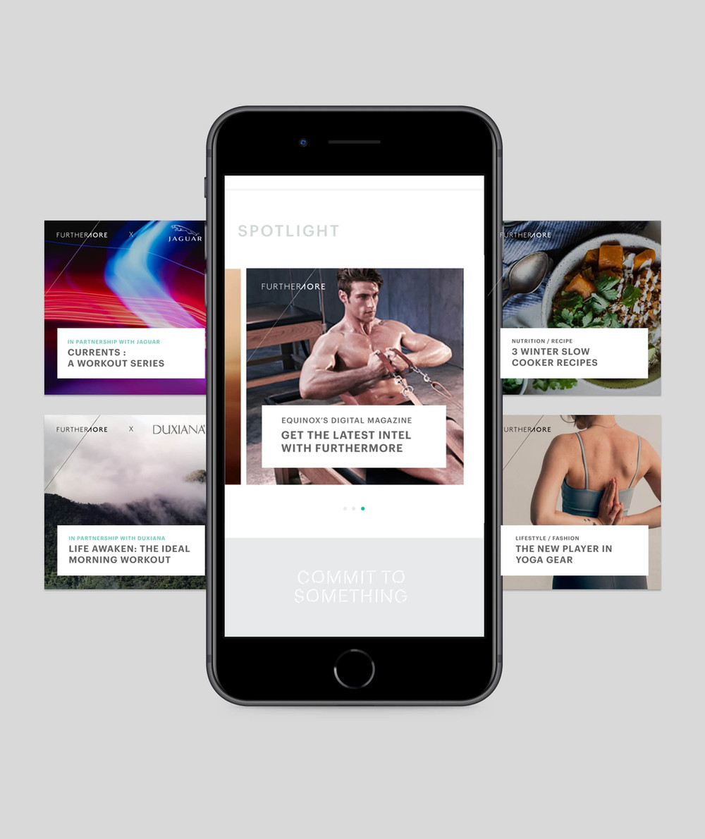
The Furthermore logo needed stronger and more consistent presence inside the app.
Within Spotlight, I established clearer image and logo rules so the brand would remain legible across article imagery.
I worked with engineering on the overlay treatment and added an alternate-image option to the article structure, giving the app a better fallback when the primary editorial image was unsuitable.
I also proposed a dedicated “Learn More” path so members could understand Furthermore instead of assuming prior familiarity.
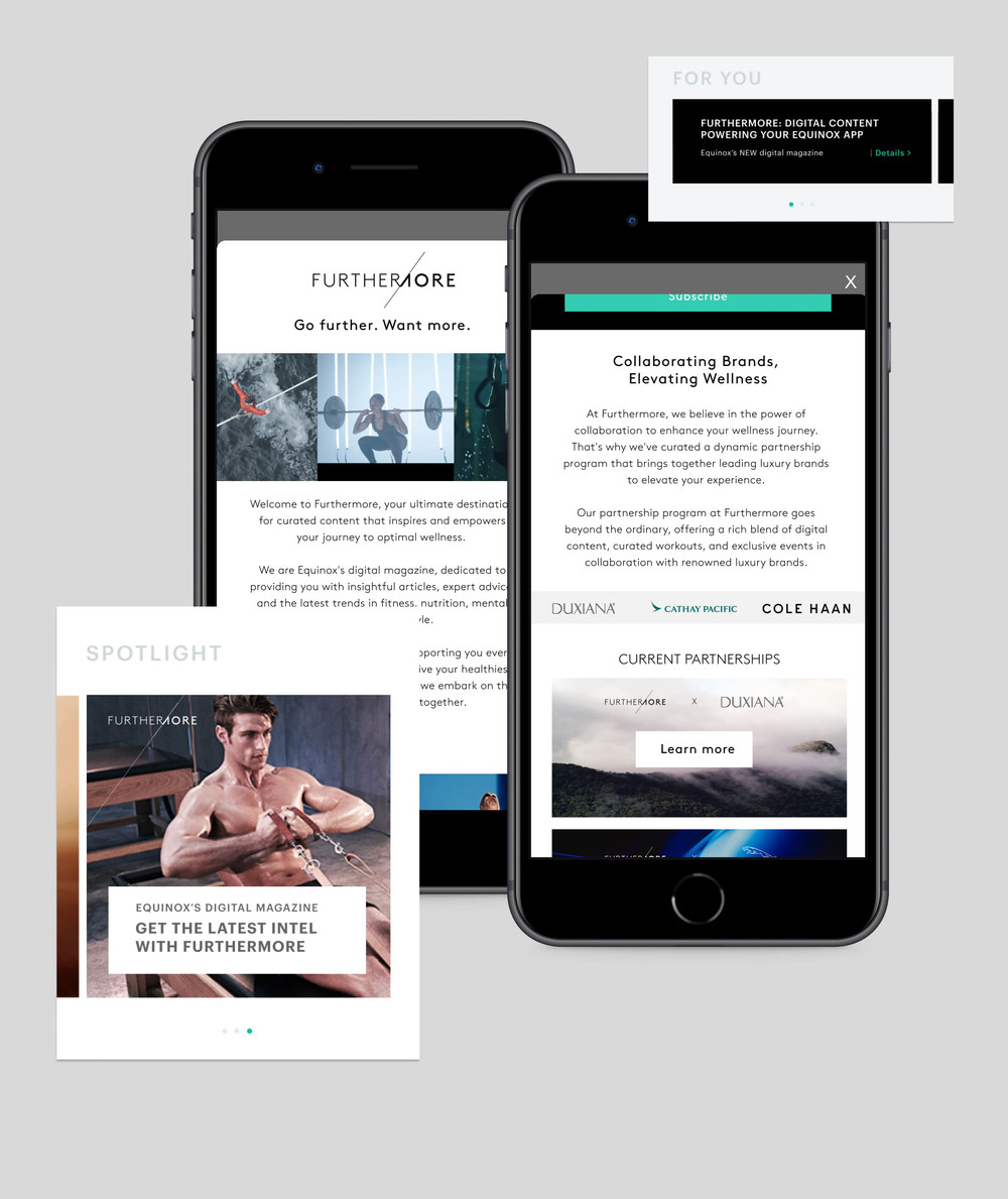
Design the system for the partnerships we wanted next.
Future collaborations would extend beyond editorial content into pop-up classes, activations, special offers, and interactive microsites.
That meant the app needed the technical and design capability to support branded moments before each new partnership arrived.
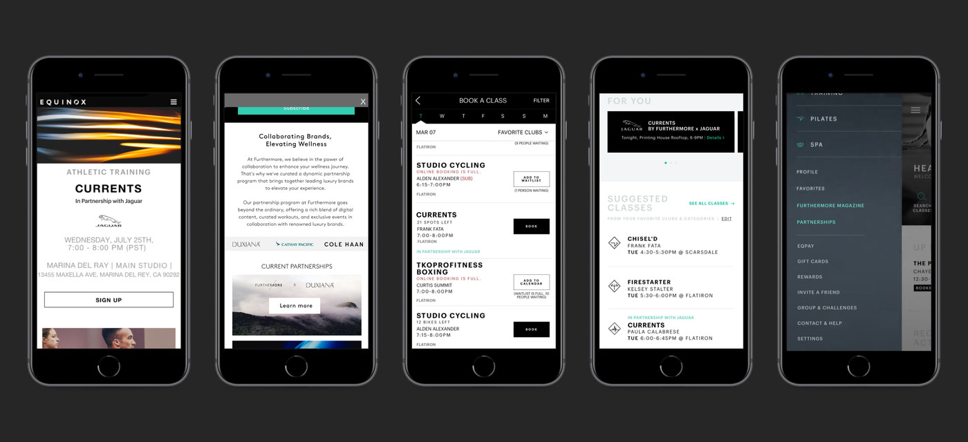
The app rebrand interrupted the build—but not the learning.
Near the end of the research and design work, Equinox began a broader rebrand and decided to rethink the app as a whole.
Some of the proposed features therefore did not ship before the redesign began.
I do not see that as a failed outcome. The work clarified how members understood the content brand, where it belonged in the information architecture, and what technical capabilities future partnership experiences would require.
Those findings became inputs for integrating Furthermore more intentionally into the next version of the Equinox ecosystem.